
|
The following is a tutorial on how to create 100x100 pixel icons for your own personal use. Now before we get into the actual icon making, I'm going to take a second and explain about personal use versus commercial use and what all of that has to do with you. There are a lot of really great resources for graphic designers on the web. From fonts, to textures, to base images, etc. However, all of these resources were made by somebody and because of that there are certain rules that go along with their use. There are two basic types of use in the web design world. Personal Use, or use just for you and a handful of others with no profit being made. Then there's commercial use where you create something and sell it to make a profit. A majority of people who offer graphics resources are 100% fine with their resources being used for personal use. Which means that if you create something using their texture or brush and you don't make any money off of it, and it's for a specific person/group of people, you're good. Generally it is considered polite/respectful to credit the creators of the resources as a way of thanks. If you are planning on making something for commercial use, you generally need a license to use certain resources, particularly fonts. Using those resources without a commercial license can end up with you running into legal trouble. TL:DR, if you're gonna make money off of this, buy a commercial license. If not, just give credit. ;) Okay, now for the fun part...the ingredients to our recipe! Ingredients: * Adobe Photoshop or something similar (GIMP works great!) * A selection of fonts that are NOT overused. * A selection of textures and brushes. * Base images of some sort * Your own creative flair. Now let's go through our list and figure out where to get these things. If you do not have adobe photoshop, GIMP is an amazing program that is very similar and is completely free. Everything I can do here, you can easily manage to do in GIMP. And GIMP also accepts photoshop brushes natively, so you don't have to worry about that. :) Fonts can easily be found at font sites such as Dafont, and Font Squirrel do make sure that you read the terms for each font before you use it in any commercial project though! I'll start with brushes first, since brushes are often easier to find. Brushes can be found at a number of sites, such as Obsidian Dawn, Brusheezy, and Inobscuro. (You can always google "Photoshop Brushes" to find a lot of them.) For this particular tutorial, I will be using Inobscuro's 100px icon brushes, which are great for icon makers. Once again, read the terms and give credit. ;) Textures are a bit harder to find, but you can easily find some at some great sites like Lost and Taken, Spoon Graphics (which has other amazing resources + great tutorials), and even some deviantart accounts such as the account of Nineke. Now you may wonder, what about animal crossing images? I mean, they're probably copyrighted by Nintendo and such...could I get in trouble for using them in my work? Due to fair use laws, you're typically safe as long as you're: 1. Creating a remix using the content. (Ex: Graphics/Icons/etc) 2. Not making a profit off of it. 3. Using content that is "published" (I.e From a game that is already released vs screenshots/spoilers from an unreleased game that the creators aren't ready to share). I put a link up there about fair use in case you have any detailed questions about it. But generally you're safe as long as you're not making a profit. (I know artists often sell fan art of Nintendo characters on shirts and mugs and things. Many of those sales are "technically" illegal under copyright law, but people often get away with them because Nintendo doesn't have time to prosecute. Oftentimes they will be deleted from art/shop sites such as etsy/society6/etc when they are reported though. The world of fan art is messy, as explained in this article. ) Anyhoo, now that we've cleared up all worries, let's get to the actual creation process! Step 1: Open up gimp/photoshop and create a 100x100 pixel workspace. I generally recommend making the background transparent initially, it just makes things easier. :)  Step 2: Now there are generally two types of icons I create for animal crossing, character based icons, or scene based icons. I'm going to start with a character based icon for this tutorial. So I will choose an animal crossing character to use. I think I'll dooooo....Ribbot. I grab the image from an animal crossing wiki and copy it in. You need to make sure that the image has a transparent (I.e clear) background to make things easier on yourself! (Most transparent background files have an extension of .PNG) Step 3: Resize the image, because chances are it's gonna be hecka big. I make sure to keep the proportions the same when I resize by using this nifty button up here at the top. 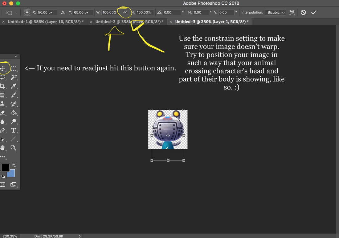  Step 4: Add a background color behind your image layer. Create a new layer behind your image, use the paint bucket tool, and fill it with a color. Try to choose a color that matches your animal crossing character. (I personally suggest using a color close to the colors in the animal itself, or a color that is complimentary.) Step 5: Now for the fun part, making the image pop out from the background using brushes and/or textures. Now as I said earlier, for this tutorial I am going to use a special set of 100x100 icon brushes that I ADORE for icon making! First I am going to create a new layer between by background layer and my layer with Ribbot. Then, I'm going to grab my brush tool and change the color. (I suggest a bright white if you have a dark background, and black if you have a light background.) Pick a 100x100 brush that looks good. Now line up that brush as best as you can with the edges of your 100x100 square and click a few times. 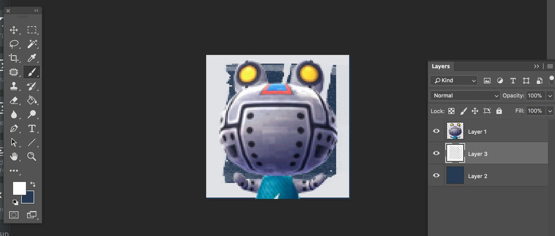 Step 6: Don't freak out that it doesn't look "good" at the moment. The main "magic" is yet to happen. Head over to your layers panel. See how it says "Normal" on the white layer we just created? We don't want that. Change the setting to another setting. I generally do "Screen", "Overlay" or "Soft Light" and adjust the opacity of one of those to suit my tastes. 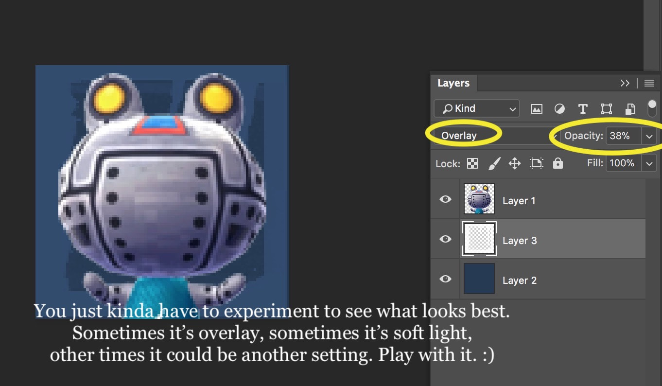 Step 7: The last two steps are easy. One is optional, one is not. The optional step is adding text. The non-optional step is adding a border. Since I want to lead you guys through everything, we'll go through the text part. Use the text tool to create a text box and choose an appropriate font.  Step 8: I ended up choosing to use FinkHeavy, which is actually the font used in the Animal Crossing logo. Notice that the text is a little hard to read? Don't worry. We're gonna fix that by "Outlining" it. Here's how we're gonna do that. Start by selecting the layer with your text, and hitting Select ---> Focus Area. Make sure that your entire text is selected. Then create a layer underneath the text layer. 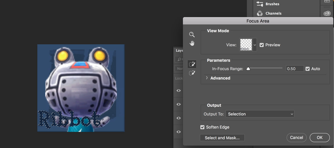 Step 9: Notice how close the selection is to our text? Doesn't seem like it'd really outline much. Let's change that. Head to the top and hit Select -----> Modify -----> Expand. Expand the selection by 1px. Then hit Select ----> Modify -----> Feather to help soften the selection a bit. Feather it by 2px. Now select the layer under your text, grab a lighter color (in this case I'm choosing white) and use the paint bucket tool a few times to fill the selection with color. 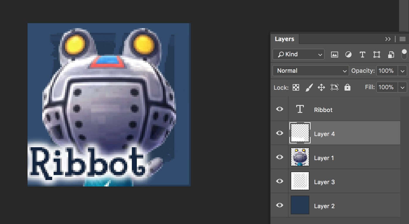 Step 10: Now that we have our text squared away, let's work on our border. Our border is simple. Create a new layer above all of the other layers, then use the selection tool to select the entire icon. After this, head to the top menu bar and hit Select ---> Modify ---> Contract. Now how much you contract depends on how big you want your border to be. I tend to like smaller borders, so I contract by 1 px. Then I go to the top and hit Select ----> Inverse.  Step 11: Notice that there is a small selection that's the perfect size for a border? Yeah. I think so too. Now there's a couple of ways we could do this: - Fill the border with black or white and use overlay/soft light/another layer setting similar to how we did our brush background. - Fill the border with a dark or light blue color. - Fill the border with a gradient (black and white - overlay/soft light) or two shades of blue. I personally and pretty simple, so I'm gonna use my paint bucket, fill the border with white, and then overlay it. Adjust the opacity, and I'm done. Now all I have to do is export my image and host it somewhere! (Might I suggest Imgur?) 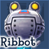 The finished product! Nice and shiny! Hopefully this tutorial has helped you. Next tutorial I'll talk about how to create a different type of icon, that I call a "scene" icon. Also, if you have any suggestions for future tutorials, lemme know. :)
Hope you enjoy this process~! -Sunny
0 Comments
Leave a Reply. |
 RSS Feed
